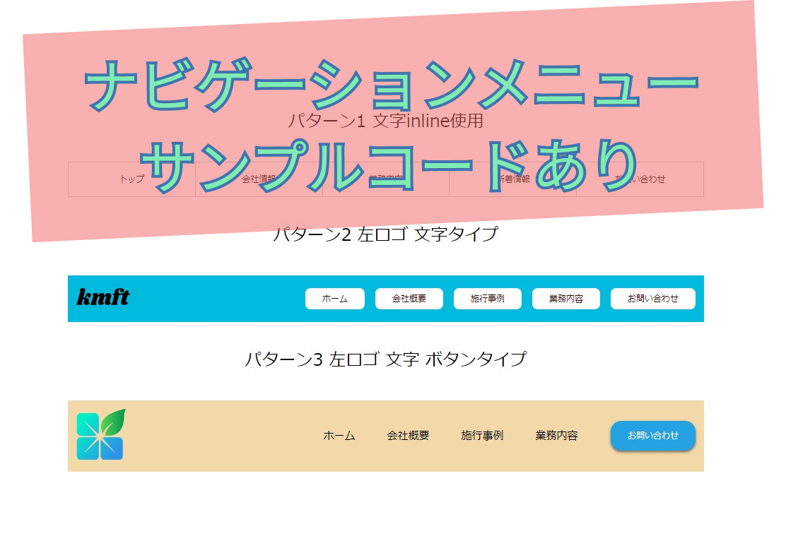
サイトのナビゲーションメニューでよく見る
3タイプのコードを記録してみました。
HTML・CSSのサンプルコードあり
よかったら参考にしてください。
今回作成したナビゲーションメニュー
リセットCSS
@charset "utf-8";
*{
	box-sizing: border-box;
}

html,body{
	width: 100%;
	margin: 0 auto;
	padding: 0;
	text-align: center;
  font-size: 16px;
}

h1,h2,h3,h4,h5,h6,p{
	margin: 0;
	padding: 0;
	font-size: 100%;
	font-weight: 400;
}

a{
  text-decoration: none;
  color: rgb(0, 0, 0);
}

section{
	padding: 50px 0;
}

.contents-wrapper{
	width: 100%;
	max-width: 1200px;
	margin: 0 auto;
}

li{
  list-style: none;
}

ul{
  margin: 0;
  padding: 0;
}

h2{
  font-size: 2rem;
}
.topspace{
  margin-top: 100px;
}
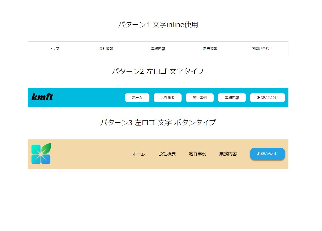
パターン1 文字inline使用
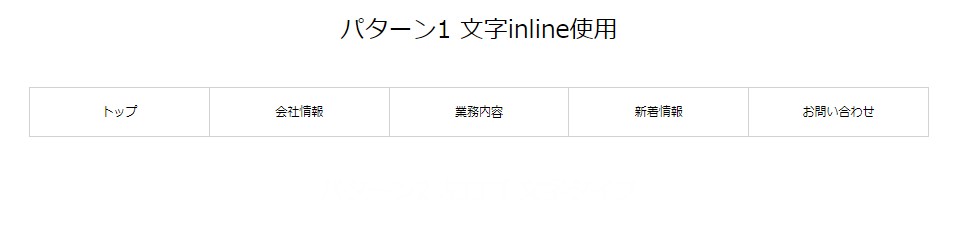
li に inline-block 指定で横並びにしてる。
letter-spacing: -.4em; と
letter-spacing: normal; で段落落ちを制御
実際に書いたコード
HTML
<section class="p-1">
    <div class="contents-wrapper">
      <nav class="h-nav">
        <ul class="nav-lists">
          <li class="nav-item">
            <a href="#" class="h-box">トップ</a>
          </li>

          <li class="nav-item">
            <a href="#" class="h-box">会社情報</a>
          </li>

          <li class="nav-item">
            <a href="#" class="h-box">業務内容</a>
          </li>

          <li class="nav-item">
            <a href="#" class="h-box">新着情報</a>
          </li>

          <li class="nav-item">
            <a href="#" class="h-box">お問い合わせ</a>
          </li>
        </ul>
      </nav>
    </div>
  </section>
CSS
.h-nav{
  border-top: 1px solid rgb(210, 210, 210);
  border-bottom: 1px solid rgb(210, 210, 210);
}
.nav-lists{
  margin: 0;
  padding: 0;
  letter-spacing: -.4em;
}
.nav-lists:first-child{
  border-left: 1px solid rgb(210, 210, 210);
}
.nav-item{
  display: inline-block;
  width: calc(100% / 5);
  position: relative;
  height: 64px;
  border-right: 1px solid rgb(210, 210, 210);
  vertical-align: bottom;
  letter-spacing: normal;
}
.nav-item:hover{
  background-color: rgb(230, 235, 250);
}
.nav-item:hover::before{
  content: "";
  width: 3px;
  height: 80%;
  position: absolute;
  top: 50%;
  left: 4%;
  transform: translateY(-50%);
  background-color: rgb(14, 54, 202);
}
.h-box{
  display: block;
  position: absolute;
  top: 50%;
  left: 50%;
  transform: translate(-50%, -50%);
}
パターン2 左ロゴ 文字タイプ
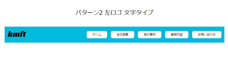
flexboxで横並びの指定
gapで間隔をあけてます。
実際に書いたコード
HTML
  <section class="p-2">
    <div class="contents-wrapper  header">
      <div class="nav-wrapper">
        <div class="header-logo">
          <img src="https://inomiti.com/imgs/kmftlogo.png" alt="navロゴ
          ">
        </div>
        <div class="navgation">
          <ul class="navgation-lists">
            <li class="nav-list2">
              <a href="">ホーム</a>
            </li>
            <li class="nav-list2">
              <a href="">会社概要</a>
            </li>
            <li class="nav-list2">
              <a href="">施工事例</a>
            </li>
            <li class="nav-list2">
              <a href="">事業内容</a>
            </li>
            <li class="nav-list2">
              <a href="">お問い合わせ</a>
            </li>
          </ul>
        </div>
      </div>

    </div>
  </section>
CSS
.header{
  background-color: rgb(0, 187, 221);
  padding: 1.5em 0;
}

.nav-wrapper{
  display: flex;
  justify-content: space-between;
  align-items: center;
}

.header-logo{
  width: 10%;
  padding-left: 1em;
}

.header-logo img{
  width: 100%;
}

.navgation-lists{
  display: flex;
  gap: 20px;
  padding-right: 1em;
}

.nav-list2 a{
  display: block;
  color: rgb(49, 1, 1);
  background-color: rgb(255, 255, 255);
  border-radius: 10px;
  text-align: center;
  padding: 0.5em 2em;
}

.nav-list2 a:hover{
  background-color: rgb(126, 196, 236);
  background-image:  linear-gradient(102deg, rgb(126, 196, 236) 19%, rgb(153, 218, 210) 60%, rgb(200, 237, 240) 100%);
  box-shadow: 9px 10px 18px -8px rgb(27, 24, 24);
  border-radius: 10px;
}
パターン3 左ロゴ 文字 ボタンタイプ
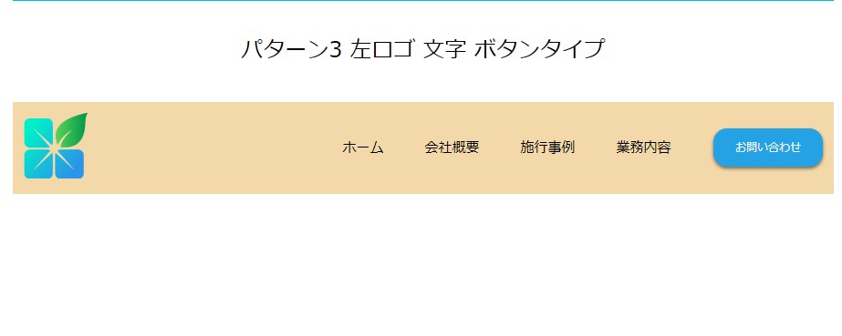
flexboxで横並びの指定
margin-rightで間隔開けてます。
実際に書いたコード
HTML
  <section class="p-3">
    <div class="contents-wrapper pattern3">
      <a href="#" class="logo">
        <img src="https://inomiti.com/imgs/inoprologo.png" alt="inoprologo">
      </a>

      <nav class="p3-navigation">
        <ul class="p3nav-list">
          <li>
            <a href="#">ホーム</a>
          </li>
          <li>
            <a href="#">会社概要</a>
          </li>
          <li>
            <a href="#">施工事例</a>
          </li>
          <li>
            <a href="#">事業内容</a>
          </li>
        </ul>
      </nav>
      <a href="#" class="btn">お問い合わせ</a>
    </div>
  </section>
CSS
.pattern3{
  display: flex;
  align-items: center;
  padding: 1em;
  background-color: rgb(243, 217, 169);
}

.logo{
  width: 8%;
}

.logo img{
  width: 100%;
}

.p3-navigation{
  margin-left: auto;
}

.p3nav-list{
  display: flex;
  align-items: center;
  margin-right: 2em;
}

.p3nav-list li a{
  display: block;
  font-size: 1.25rem;
  padding: 1em 1.25em;
  position: relative;
}

.p3nav-list li a:hover{
  transform: scale(1.1, 1.1);
}

.p3nav-list li a:hover::before{
  content: "";
  width: 60%;
  height: 3px;
  background-color: rgb(37, 162, 228);
  position: absolute;
  bottom: 22%;
  left: 50%;
  transform: translateX(-50%);
}

.btn{
  color: rgb(250, 250, 250);
  background-color: rgb(37, 162, 228);
  padding: 1em 2em;
  display: inline-block;
  border-radius: 20px;
  box-shadow: 0 3px 5px rgb(0 0 0 / 50%);
}

.btn:hover{
  box-shadow: none;
  transform: scale(0.99, 0.99) translateY(2px);
  opacity: 0.8;
}
YouTube動画
よかったらチャンネル登録お願いいたします。


コメント