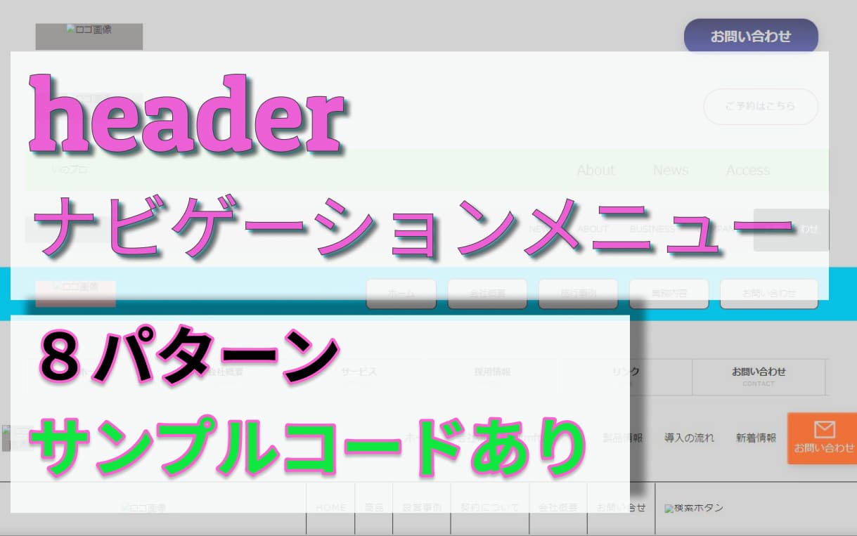
headerナビゲーションメニュー (headernav)いろいろなパターンがある。
また、案件によって微妙に違ってくるので、基本のパターンのコードを
リスト化してみました。
とりあえずこの記事では、私が最近までに作ってきた物を
取り上げてみました。
NAVメニューを並べる方法は、基本display: flex;を
使用してます。
最初の実案件で、ググりながら作成したものも入ってます。
よかったら参考にしてください。
ロゴや画像の部分はbackground-colorで表現。
実際に使う場合はbackground-colorの指定外して、
画像はめ込んでOKです。
すべてに共通であててるCSSはこんな内容であててます。
CSSリセット及び共通部分
@charset "utf-8";

*{
	box-sizing: border-box;
}

h1,h2,h3,h4,h5,h6,p{
	margin: 0;
	padding: 0;
	font-size: 100%;
	font-weight: 400;
}

li {
  list-style: none;
}

ul,ol{
	margin: 0;
	padding: 0;
	list-style-type: none;
}

a {
  text-decoration: none;
  color: rgb(0, 0, 0);
	transition: 0.6s;
	-webkit-transition: 0.6s;
	-moz-transition: 0.6s;
	-ms-transition: 0.6s;
	-o-transition: 0.6s;
}

html,body{
	width: 100%;
	margin: 0 auto;
	padding: 0;
	text-align: center;
  font-size: calc((100vw - 770px) / 325 + 14px);
  font-family: 'Noto Sans JP', sans-serif;
}

@media screen and (min-width:768px) {
.sp{
	display: none;
}
}

@media screen and (max-width:767px) {
.pc{
	display: none;
}

section:not(.s-1){
  width: 100%;
	padding: 50px 0 0 0;
}

.container{
	max-width: 1500px;
	margin: 0 auto;
}

@media screen and (max-width:767px) {
    section{
        padding: 20px 0 0 0;
    }
}

.header-wrap {
  width: 100%;
}
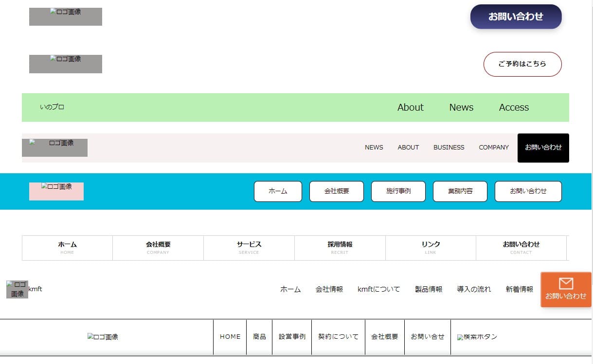
1.左サイドにロゴ右にお問い合わせボタン
超シンプルタイプ
お問い合わせボタンはホバーで色が変化する設定。
HTML
    <div class="container">
      <div class="header-wrap">
        <div class="header-innner1">
          <h1 class="h-title1">
            <a href="">
              <img class="h-logo" src="#" alt="ロゴ画像">
            </a>
          </h1>
          <div class="h-btn1">
            <a href="#" class="h-btn-text1">
              お問い合わせ
            </a>
          </div>
        </div>
      </div>
    </div>
CSS
.header-innner1 {
  display: flex;
  justify-content: space-between;
  align-items: center;
  height: 100px;
  padding: 0 20px;
}

.h-title1 {
  width: 200px;
  margin-right: 10px;
  /* 画像入れたら削除でOK */
  height: 50px;
  background-color: #9e9b9b;
}

.h-title1 img {
  /* display: block; */
  width: 100%;
  object-fit: cover;
  vertical-align: bottom;
}

.h-btn1 {
  background: #63B13C;
  border-radius: 30px;
}

.h-btn-text1 {
  display: block;
  color: #fff;
  font-size: 1.5rem;
  text-decoration: none;
  padding: 15px 50px;
}

/* ================ */
.h-btn1 {
  position: relative;
  display: inline-block;
  background: linear-gradient(to bottom, #1b1c3f, #4a4e91);
  color: white;
  font-weight: bold;
  font-size: 1.5rem;
  border: none;
  border-radius: 30px;
  cursor: pointer;
  box-shadow: 0 5px 15px rgba(0, 0, 0, 0.2);
  animation: button-shimmer 2s infinite;
  transition: all 0.3s ease-in-out;
}

/* Hover animation */
.h-btn1:hover {
  background: linear-gradient(to bottom, #2c2f63, #5b67b7);
  animation: button-particles 1s ease-in-out infinite;
  transform: translateY(-2px);
}

/* Click animation */
.h-btn1:active {
  transform: scale(0.95);
  box-shadow: 0 2px 10px rgba(0, 0, 0, 0.3);
}

/* Shimmer animation */
@keyframes button-shimmer {
  0% {
    background-position: left top;
  }

  100% {
    background-position: right bottom;
  }
}

/* Particle animation */
@keyframes button-particles {
  0% {
    background-position: left top;
  }

  100% {
    background-position: right bottom;
  }
}
2.左サイドにロゴ右に予約ボタン
1と同じ感じのタイプになります。
ご予約はこちらをホバーでボタンに色が入る設定。
HTML
  <section class="s-2">
    <div class="container">
      <header id="header">
        <h1 class="h-title2">
          <a class="logo" href="index.html">
            <img src="#" alt="ロゴ画像">
          </a>
        </h1>
        <div class="button2">
        <a href="#" class="h-btn-text2">
          ご予約はこちら
        </a>
      </div>
      </header>
    </div>
  </section>
CSS
#header {
  display: flex;
  height: 100px;
  justify-content: space-between;
  align-items: center;
  padding: 0 20px;
}
/* ヘッダーロゴ */
.h-title2 {
  width: 200px;
    /* 画像入れたら削除でOK */
    height: 50px;
    background-color: rgb(158, 155, 155);
}

.h-title2 img {
  width: 100%;
  object-fit: cover;
  vertical-align: bottom;
}
/* ヘッダー申し込みボタン */
/* .button2 {
  background: rgb(153, 0, 0);
  border-radius: 40px;
} */
.h-btn-text2 {
  display: block;
  color:rgb(0, 0, 0);
  padding: 20px 40px;
  font-size: 1rem;
  font-weight: bold;
  letter-spacing: 2px;
}

.button2 {
  position: relative;
  border-radius: 40px;
  border: 1px solid rgb(153, 0, 0);
  text-transform: uppercase;
  background: transparent;
  color: rgb(255, 255, 255);
  overflow: hidden;
  box-shadow: 0 0 0 0 transparent;
  -webkit-transition: all 0.2s ease-in;
  -moz-transition: all 0.2s ease-in;
  transition: all 0.2s ease-in;
}

.button2:hover {
  background: rgb(250, 94, 69);
  box-shadow: 0 0 30px 5px rgba(153, 0, 0, 0.815);
  -webkit-transition: all 0.2s ease-out;
  -moz-transition: all 0.2s ease-out;
  transition: all 0.2s ease-out;
}

.button2:hover::before {
  -webkit-animation: sh02 0.5s 0s linear;
  -moz-animation: sh02 0.5s 0s linear;
  animation: sh02 0.5s 0s linear;
}

.button2::before {
  content: '';
  display: block;
  width: 0px;
  height: 86%;
  position: absolute;
  top: 7%;
  left: 0%;
  opacity: 0;
  background: rgb(255, 255, 255);
  box-shadow: 0 0 50px 30px rgb(255, 255, 255);
  -webkit-transform: skewX(-20deg);
  -moz-transform: skewX(-20deg);
  -ms-transform: skewX(-20deg);
  -o-transform: skewX(-20deg);
  transform: skewX(-20deg);
}

@keyframes sh02 {
  from {
    opacity: 0;
    left: 0%;
  }

  50% {
    opacity: 1;
  }

  to {
    opacity: 0;
    left: 100%;
  }
}

.contact-btn:active {
  box-shadow: 0 0 0 0 transparent;
  -webkit-transition: box-shadow 0.2s ease-in;
  -moz-transition: box-shadow 0.2s ease-in;
  transition: box-shadow 0.2s ease-in;
}
3.左部分テキスト挿入右部分ナビゲーションメニュー
ナビゲーションメニュー部分部背景色をつけました。
メニュー部分ホバーで下線が右から流れて表示。
HTML
  <section class="s-3">
    <div class="container">
      <header class="header3">
        <h1 class="site-title3">
          <a href="./">
            いのプロ
          </a>
        </h1>
        <div class="nav-wrapper">
          <nav class="header-nav">
            <ul class="nav-list3">
              <li class="nav-item3 to-right">
                <a href="https://crestadesign.org/">
                  About
                </a>
              </li>
              <li class="nav-item3 to-right">
                <a href="https://crestadesign.org/">
                  News
                </a>
              </li>
              <li class="nav-item3 to-right">
                <a href="https://crestadesign.org/">
                  Access
                </a>
              </li>
            </ul>
          </nav>
        </div>
      </header>
    </div>
  </section>
CSS
.header3{
  background-color: rgb(186, 240, 179);
  color: rgb(130, 203, 246);
  height: 80px;
  padding: 0 50px;
  border-bottom:1px solid rgb(255, 255, 255);
  display: flex;
  justify-content: space-between;
  align-items: center;
}

.sait-title3 a {
  display: block;
  font-size: 1.5rem;
  color: rgb(51, 51, 51);
  padding: 20px 5px;
}

.nav-list3 {
  display: flex;
  justify-content: space-between;
}

.nav-item3 {
  margin-right: 50px;
  position: relative;
}

.nav-item3 a {
  display: block;
  font-size: 1.5rem;
  padding: 20px 10px;
}

.nav-item3::after {
  background-color: rgb(234, 30, 146);
  bottom: 20px;
  content: "";
  display: block;
  height: 3px;
  position: absolute;
  transition: 0.3s all;
  width: 0;
}

.nav-item3:hover:after {
  width: 100%;
}

.to-right::after {
  left: 0;
}
4.3とほぼ同じで、右部分にお問い合わせボタン追加
メニュー部分ホバーで下線が表示。
お問い合わせボタンホバーで文字拡大設定。
HTML
  <section class="s-4">
    <div class="container">
      <header id="head4" class="inner">
        <div class="h-wrapper4">
          <h1 class="logo4">
            <a href="index.html">
              <img src="#" alt="ロゴ画像">
            </a>
          </h1>
          <nav class="nav-wrapper4">
            <ul class="nav-lists4">
              <li><a href="#news">NEWS</a></li>
              <li><a href="#about">ABOUT</a></li>
              <li><a href="#business">BUSINESS</a></li>
              <li><a href="#company">COMPANY</a></li>
              <li class="contact-btn"><a href="#">お問い合わせ</a></li>
            </ul>
          </nav>
        </div>
      </header>
    </div>
  </section>
CSS
#head4 {
  height: 80px;
  background-color: rgb(247, 241, 241);
}

.h-wrapper4 {
  display: flex;
  justify-content: space-between;
  align-items: center;
}

.logo4 {
  width: 180px;
  padding-left: 20px;
    /* 画像入れたら削除でOK */
    height: 50px;
    background-color: rgb(158, 155, 155);
}

.logo4 img {
  display: block;
  width: 100%;
  object-fit: cover;
}

.nav-lists4 {
  display: flex;
  text-align: center;
  justify-content: space-between;
}

.nav-lists4 li a{
  display: block;
  line-height: 80px;
  padding: 0 20px;
}

.nav-lists4 li a:not(.contact-btn a):hover::before {
  content: "";
  width: 60%;
  height: 3px;
  background-color: rgb(37 162 228);
  position: absolute;
  bottom: 22%;
  left: 50%;
  transform: translateX(-50%);
}

.nav-lists4 li a:hover {
  transform: scale(1.1, 1.1);
}

.contact-btn {
  border-radius: 5px;
  background-color: rgb(0, 0, 0);
  text-align: center;
  margin-left: 5px;
}

.contact-btn a {
  height: 80px;
  line-height: 80px;
  color: rgb(255, 255, 255);
  font-size: 1rem;
  display: block;
}

.contact:hover {
  background-color: rgb(51, 51, 51);
}
5.メニュー部分にbackground-color設定。
メニュー部分をホバーすると色が表示される。
ナビゲーションメニューのbackground-colorが画面
サイズいっぱいに広がるがメニュ部分は1500pxまでで固定。
HTML
 <section class="s-5">
    <div class="bg-inner">
      <div class="container">
        <header>
            <div class="h-wrapper5">
              <h1 class="header-logo5">
                <img src="#" alt="ロゴ画像">
              </h1>
              <div class="h-nav5">
                <ul class="h-nav-items5">
                  <li class="nav-item5"><a href="">ホーム</a></li>
                  <li class="nav-item5"><a href="">会社概要</a></li>
                  <li class="nav-item5"><a href="">施行事例</a></li>
                  <li class="nav-item5"><a href="">業務内容</a></li>
                  <li class="nav-item5"><a href="">お問い合わせ</a></li>
                </ul>
              </div>
            </div>
        </header>
      </div>
    </div>
  </section>
CSS
.bg-inner {
  background-color: rgb(0, 187, 221);
}

.h-wrapper5 {
  display: flex;
  justify-content: space-between;
  align-items: center;
  height: 100px;
  padding-left: 20px;

}

.header-logo5 {
  width: 150px;
    /* 画像入れたら削除でOK */
    height: 50px;
    background-color: rgb(246, 211, 211);
}

.header-logo5 img {
  width: 100%;
  min-height: auto;
  object-fit: cover;
  vertical-align: bottom;
}

.h-nav-items5 {
  display: flex;
  justify-content: space-between;
}

.h-nav-items5 li {
  margin-right: 20px;
}

.h-nav-items5 li a {
  display: block;
  font-size: 1rem;
  color: rgb(49, 1, 1);
  background-color: rgb(255, 255, 255);
  border: 1px solid rgb(49, 1, 1);
  border-radius: 10px;
  text-align: center;
  padding: 15px 40px;
}

.h-nav-items5 li a:hover {
  background-color: rgb(126, 196, 236);
  background-image: linear-gradient(102deg, rgb(126, 196, 236) 19%, rgb(153, 218, 210) 60%, #c8edf0 100%);
  box-shadow: 9px 10px 18px -8px rgb(27, 24, 24);
  border-radius: 10px;
}

.main-navigation li a:hover {
  color: rgb(0, 187, 221);
}

@media screen and (max-width:1100px) {
  .h-nav-items5 li {
    margin-right: 10px;
  }

  .h-nav-items5 li a {
    font-size: 0.8rem;
    padding: 15px 20px;
  }
}
6.メニュー表示日本語・英語2段で表現。
メニュをホバーするとその部分の色が変わり、左に線が表示される。
今回このナビゲーションメニューはfloatを使ってますがあえて入れてます。
inline-blockかdisplay: flex;で設定した方が簡単。
HTML
  <section class="s-6">
    <div class="container">
      <nav class="top-nav">
        <ul>
          <li><a href="#">ホーム<span class="nav-komoji">HOME</span></a></li>
          <li><a href="#">会社概要<span class="nav-komoji">COMPANY</span></a></li>
          <li><a href="#">サービス<span class="nav-komoji">SERVICE</span></a></li>
          <li><a href="#">採用情報<span class="nav-komoji">RECRIT</span></a></li>
          <li><a href="#">リンク<span class="nav-komoji">LINK</span></a></li>
          <li><a href="#">お問い合わせ<span class="nav-komoji">CONTACT</span></a></li>
        </ul>
      </nav>
    </div>
  </section>
CSS
.top-nav {
  overflow: hidden;
  border-top: 1px solid rgb(210, 210, 210);
  border-bottom: 1px solid rgb(210, 210, 210);
}

.top-nav li{
  width: 16.6%;
  float: left;
  line-height: 1.6;
}
.top-nav li a {
  display: block;
  text-decoration: none;
  text-align: center;
  padding: 12px 0;
  border-left: 1px solid rgb(210, 210, 210);
  font-weight: bold;
  position: relative;
}
.top-nav li:fist-child a {
  border-left: none;
}
.top-nav li:last-child a {
  border-right: 1px solid rgb(210, 210, 210);
}
.top-nav li a span {
  display: block;
  font-size: 9px;
  color: rgb(186, 186, 186);
  font-weight: normal;
  letter-spacing: 0.2em;
}
/* マウスオン時・訪問中ページの動作 ----------------- */
.top-nav li a:hover,
.top-nav li.current a {
  background: rgb(230, 235, 250);
}
.top-nav li a:hover::before,
.top-nav li.current a::before {
  content: "";
  position: absolute;
  left: 5px;
  width: 3px;
  height: 40px;
  background: linear-gradient(rgb(18, 68, 255), rgb(14, 54, 202));
}
.top-nav li a:hover {
  color: rgb(14, 54, 202);
}
7.4番と同じタイプの、サブメニューが表示される仕様です。
このナビゲーションメニューは、サブメニュの設定があるメニュをホバー
すると、下にメニューが表示されるようになってます。
また、画像の幅いっぱいにメニュー部分も広がっていく仕様です。
HTML
  <section class="s-7">
    <header class="header7">
      <div class="h-nav-wrap7">
        <div class="header-contents7">
          <div class="logo-wrap7">
            <a href="#" class="logo7">
              <img src="#" alt="ロゴ画像">
              <h1 class="logo-text7">
                kmft
              </h1>
            </a>
          </div>

          <nav class="top-navigation7">
            <ul class="top-nav-lists7">
              <li>
                <a href="#">
                  ホーム
                </a>
              </li>

              <li>
                <div class="nav-company">
                  <a class="company-pos">
                    会社情報
                  </a>
                  <ul class="nav-child-lists">
                    <li class="nav-child-inner">
                      <p class="nav-child-company">
                        会社情報
                      </p>
                      <div class="nav-child-textlink companyplofile">
                        <a href="#" class="nav-child-small">
                          <span class="nav-child-circle child-circle-company">
                          会社概要
                          </span>
                        </a>
                      </div>
                      <div class="nav-child-textlink faq">
                        <a href="#" class="nav-child-small">
                          <span class="nav-child-circle child-circle-faq">
                          よくある質問
                          </span>
                        </a>
                      </div>
                    </li>
                  </ul>
                </div>
              </li>

              <li>
                <a href="#">
                  kmftについて
                </a>
              </li>

              <li>
                <div class="nav-product">
                  <a class="company-pos">
                    製品情報
                  </a>
                  <ul class="nav-child-productlists">
                    <li class="nav-child-inner product-childinner">
                      <p class="nav-child-product">
                        製品情報
                      </p>
                      <div class="nav-product-crad">
                        <a href="#" class="nav-child-small">
                          <div class="nav-product-img">
                            <img src="" alt="画像">
                          </div>
                          <div class="nav-product-bottom">
                            <span class="nav-product-type">
                              特殊材料
                            </span>
                          </div>
                        </a>
                      </div>

                      <div class="nav-product-crad">
                        <a href="#">
                          <div class="nav-product-img">
                            <img src="" alt="画像2">
                          </div>
                          <div class="nav-product-bottom">
                            <span class="nav-product-type">
                              実験製品
                            </span>
                          </div>
                        </a>
                      </div>

                      <div class="nav-product-crad">
                        <a href="#">
                          <div class="nav-product-img">
                            <img src="" alt="画像3">
                          </div>
                          <div class="nav-product-bottom">
                            <span class="nav-product-type">
                              実験装置
                            </span>
                          </div>
                        </a>
                      </div>
                    </li>
                  </ul>
                </div>
              </li>

              <li>
                <a href="#">
                  導入の流れ
                </a>
              </li>
              <li>
                <a href="#">
                  新着情報
                </a>
              </li>
            </ul>
          </nav>

          <div class="nav-btn7 nav-btn7-2">
            <a href="#">
              <img src="https://inopro.jpn.org/wp-content/uploads/2023/08/nav-mail.png" alt="メール">
              お問い合わせ
            </a>
          </div>
        </div>
      </div>
    </header>
  </section>
CSS
.header7{
  position: relative;
}

.header-contents7{
	display: flex;
	align-items: center;
	background-color: rgba(255, 255, 255, 0.7);
  padding-left: 20px;
  height: 100px;
}

.top-navigation7{
	margin-left: auto;
}

.logo7{
  display: flex;
  justify-content: center;
  align-items: center;
}

.logo7 img{
  width: 60px;
	height: 50px;
  object-fit: cover;
  vertical-align: bottom;
  /* 画像入れたら削除でOK */
  background-color: rgb(158, 155, 155);
}

.logo-text7{
  color: rgb(0, 0, 0);
	font-size: 1rem;
}

.top-nav-lists7{
  display: flex;
	align-items: center;
  justify-content: space-between;
}

.top-nav-lists7 a{
	display: block;
  line-height: 100px;
  padding: 0 20px;
  color: rgb(0, 0, 0);
	font-size: 1.125rem;
}

.nav-btn7 {
  width: 140px;
  color: rgb(255, 255, 255);
  border-radius: 5px;
  padding: 15px 13px;
  font-weight: 500;
  background: transparent;
  cursor: pointer;
  transition: all 0.3s ease;
  position: relative;
  display: inline-block;
  box-shadow: inset 2px 2px 2px 0px rgba(255,255,255,.5), 7px 7px 20px 0px rgba(0,0,0,.1), 4px 4px 5px 0px rgba(0,0,0,.1);
  outline: none;
  font-size: 15px;
}

.nav-btn7-2 {
  background: rgb(233, 107, 52);
  background: linear-gradient(0deg, rgb(233, 107, 52) 0%, rgb(233, 107, 52) 100%);
  border: none;
}

.nav-btn7-2:before {
  height: 0%;
  width: 2px;
}

.nav-btn7-2:hover {
  box-shadow: 4px 4px 6px 0 rgba(255,255,255,.5),
              -4px -4px 6px 0 rgba(116, 125, 136, .5),
    inset -4px -4px 6px 0 rgba(255,255,255,.2),
    inset 4px 4px 6px 0 rgba(0, 0, 0, .4);
}

.nav-btn7 a{
	display: block;
	font-size: 1.125rem;
  color: rgb(255, 255, 255);
}

.nav-btn7 img{
  display: block;
	width: 40px;
  margin: 0 auto 5px;

}

.nav-child-lists,
.nav-child-productlists{
	position: absolute;
	width: 100%;
	margin: auto;
	top: 100px;
	left: 0;
	right: 0;
	background-color: rgb(13, 59, 134);
	/*デフォルトでは非表示の状態にしておく*/
	visibility: hidden;
	opacity: 0;
	/*不透明度0*/
}

ul .nav-child-inner{
	width: 100%;
  display: flex;
	gap: 40px;
	align-items: center;
	justify-content: space-around;
}

.product-childinner{
	width: 100%;
	justify-content: space-around;
}

.company-pos{
	position: relative;
	padding: 2.5em 0;
}

.company-pos::after{
	content: "";
	width: 0;
	height: 0;
	margin: 0 auto;
	border-style: solid;
	border-color: transparent transparent rgb(13, 59, 134) transparent;
	position: absolute;
	bottom: -3px;
	border-width: 0 20px 34px 20px;
	left: 50%;
	transform: translateX(-50%);
	/* デフォルトでは非表示の状態にしておく */
	visibility: hidden;
	/* 不透明度0 */
	opacity: 0;
	transition-duration: 0;
}

.nav-company:hover .nav-child-lists{
	visibility: visible;/*Gナビメニューにホバーしたら表示*/
	opacity: 1;/*不透明度1*/
	z-index: 100;
	transition: 1s;
}

.nav-product:hover .nav-child-productlists{
	visibility: visible;/*Gナビメニューにホバーしたら表示*/
	opacity: 1;/*不透明度1*/
	z-index: 100;
	transition: 1s;
}

.nav-company:hover .company-pos::after,
.nav-product:hover .company-pos::after{
	transition: all .5s ease-in 0.04s;
	visibility: visible;/*Gナビメニューにホバーしたら表示*/
	opacity: 1;/*不透明度1*/
	z-index: 50;
}

.nav-child-company,
.nav-child-product{
	margin-right: 28%;
	font-size: 1.56rem;
  padding: 10px;
  color: rgb(255, 255, 255);
}

.nav-child-product{
	margin-left: 5%;
	margin-right: 0;
}

.nav-child-textlink{
	width: 100%;
	max-width: 13%;
}

.nav-child-textlink.companyplofile{
	margin-right: 10%;
}

.nav-child-textlink a{
	position: relative;
	display: block;
	font-size: 0.875rem;
	padding: 10px;
	color: rgb(255, 255, 255);
}

.nav-child-circle::after,
.nav-product-bottom::after
{
	content: "";
	width: 20px;
	height: 20px;
	background-image: url(./imgs/arrow-circle-white.png);
	background-repeat: no-repeat;
	background-position: center;
	background-size: contain;
	position: absolute;
	top: 50%;
	right: 0;
	transform: translateY(-50%);
}

.nav-child-circle.child-circle-company::after{
	right: 44px
}

.nav-child-circle.child-circle-faq::after{
	right: 16px
}

.companyplofile a::after{
	position: absolute;
	top: 50%;
	left: 50%;
}

.faq a::after{
	position: absolute;
	top: 50%;
	left: 60%;
}

.nav-product-crad{
	width: 100%;
	max-width: 15%;

}

.nav-product-crad:last-child{
	margin-right: 0;
}

.nav-product-crad a{
	padding: 5px;
}

.nav-product-img{
  width: 100%;
  height: 100px;
  background-color: rgb(116, 132, 135);
}

.nav-product-img img{
  width: 100%;
  height: auto;
  object-fit: cover;
  vertical-align: bottom;
}

.nav-product-bottom{
	position: relative;
	padding: 5px 0;
  color: rgb(255, 255, 255);
  line-height: 50px;
}

@media screen and (min-width:1711px) {
  .nav-btn7 {
    padding: 17px 10px;
}
}
8.7と同じで、サブメニュが違う感じで表示される仕様です。
このナビゲーションメニューは、サブメニュの設定があるメニュをホバー
すると、下にメニューが表示されるようになってます。
メニュー部分は1500pxまでの設定になります。
HTML
  <section class="s-8">
    <header class="header8">
      <div class="header-bar">
        <div class="header-bar-inner">
          <h1 class="header-logo8">
            <a href="#">
              <img src="#"
                alt="ロゴ画像"></a>
          </h1>
          <nav class="global-nav-container">
            <ul class="p-global-nav">
              <li class="menu-item8">
                <a href="#" aria-current="page" class="link">
                  HOME
                </a>
              </li>
              <li class="menu-item8 sub-link8">
                <a href="#">
                  商品
                </a>
                <ul class="sub-menu8">
                  <li>
                    <a href="#" class="link">会場設営用品【屋内】
                    </a>
                  </li>
                  <li>
                    <a href="#" class="link">会場設営用品【屋外】
                    </a>
                  </li>
                  <li>
                    <a href="#" class="link">式典・セレモニー
                    </a>
                  </li>
                  <li>
                    <a href="#" class="link">家電・家具・布団
                    </a>
                  </li>
                  <li>
                    <a href="#" class="link">
                      映像
                    </a>
                  </li>
                  <li>
                    <a href="#" class="link">
                      音響・通信カラオケ
                    </a>
                  </li>
                  <li>
                    <a href="#" class="link">
                      アミューズメント
                    </a>
                  </li>
                  <li>
                    <a href="#" class="link">
                      スポーツ・レジャー・介護用品
                    </a>
                  </li>
                  <li>
                    <a href="#" class="link">
                      ベビー用品
                    </a>
                  </li>
                  <li>
                    <a href="#" class="link">
                      調理器具
                    </a>
                  </li>
                  <li>
                    <a href="#" class="link">
                      季節用品
                    </a>
                  </li>
                  <li>
                    <a href="#" class="link">
                      照明
                    </a>
                  </li>
                  <li>
                    <a href="#" class="link">
                      仮設トイレ・手洗器
                    </a>
                  </li>
                  <li>
                    <a href="#" class="link">
                      バルーン
                    </a>
                  </li>
                  <li>
                    <a href="#" class="link">
                      トラベル用品
                    </a>
                  </li>
                  <li>
                    <a href="#" class="link">
                      事務用品・選挙用品
                    </a>
                  </li>
                  <li>
                    <a href="#" class="link">
                      その他
                    </a>
                  </li>
                </ul>
              </li>

              <li class="menu-item8">
                <a href="#" class="link">
                  設営事例
                </a>
              </li>

              <li class="menu-item8 sub-link8">
                <a href="#" class="link">
                  契約について
                </a>
                <ul class="sub-menu8 sub-block">
                  <li>
                    <a href="#" class="link">
                      キャンセルについて
                    </a>
                  </li>
                  <li>
                    <a href="#" class="link">
                      契約条項
                    </a>
                  </li>
                </ul>
              </li>

              <li class="menu-item8">
                <a href="#" class="link">
                  会社概要
                </a>
              </li>

              <li class="menu-item8 sub-link8">
                <a href="#" class="link">
                  お問い合せ
                </a>
                <ul class="sub-menu8 sub-block">
                  <li>
                    <a href="#" class="link">
                      商品について
                    </a>
                  </li>
                  <li>
                    <a href="#" class="link">
                      企画について
                    </a>
                  </li>
                </ul>
              </li>
              <li class="menu-item8 sub-link8 search-ic">
                <a href="#">
                  <img src="./images/serach.png" alt="検索ボタン">
                </a>
                <div class="sub-menu8 p-header-search">
                  <form action="" method="get">
                    <input type="text" name="s" value="" class="p-header-search__input" placeholder="SEARCH">
                  </form>
                  <a href="#" class="p-search-button c-search-button"></a>
                </div>
              </li>
            </ul>
          </nav>
        </div>
      </div>
    </header>
  </section>
CSS
.header-bar{
	width: 100%;

	background: url(https://inopro.jpn.org/wp-content/uploads/2023/08/header-bar-bg.jpg) repeat-x right bottom;
	border-top: 1px solid #000;
	border-bottom: 1px solid #000;
}

.header-bar-inner{
	width: 100%;
  height: 100px;
	margin: 0 auto;
	display: flex;
	align-items: center;
	justify-content: space-evenly;
}

.header-logo8 img{
	width: 300px;
	margin-right: 20px;
}

.p-header-search{
	width: 100px;
}

.global-nav-container ul.p-global-nav{
	width: 100%;
	margin: 0;
	padding: 0;
	list-style: none;
	display: flex;
	align-items: center;
}

.menu-item8{
	border-left: 1px solid #000;
}

.menu-item8 a {
	display: inline-block;
	padding: 40px 15px;
	color: black;
	text-align: center;
	text-decoration: none;
	text-indent: 2px;
	letter-spacing: 2px;
	line-height: 1;
	transition: 0.4s;
}

.search-ic a {
	position: relative;
	border-right: none;
}

.sub-menu8 {
	position: absolute;
	opacity: 0;
	visibility: hidden;
  background-color: #050089;
	display: flex;
	flex-wrap: wrap;
	max-width: 750px;
	transition: 0.4s;
}

.sub-menu8.p-header-search {
	background-color: transparent;
}

.p-header-search__input {
	height: 50px;
	width: 280px;
	position: absolute;
  top: 5px;
	left: -50%;
}

.sub-menu8.sub-block{
	display: block;
	max-width: 250px;
}

.sub-link8:hover .sub-menu8 {
	opacity: 1;
	visibility: visible;
}

.menu-item8 ul li a {
  display: block;
	width: 250px;
	padding: 15px;
	color: #fff;
	text-align: left;
  font-size: 1rem;
}

.menu-item8 ul li a:hover {
	background-color: #87cefa;
	color: #19288c;
}
今回は、リスト化で1ファイルにコード書いてるので、
headerですが上部に固定するコードでは書いてません。
かくheaderをsectionでくくって書いてます。
実際にページの上部に固定する場合は、
header全体に対して
topに固定の場合
position: fixed;
top: 0;
left: 0;
を指定すると固定されたヘッダーになります。
このサンプルは、これからまだまだ追加していく予定です。

コメント