こんにちは 今回は最近話題のPOPOVER APIを使って、
ヘッダーにポップオーバーメニューを作ってみました。
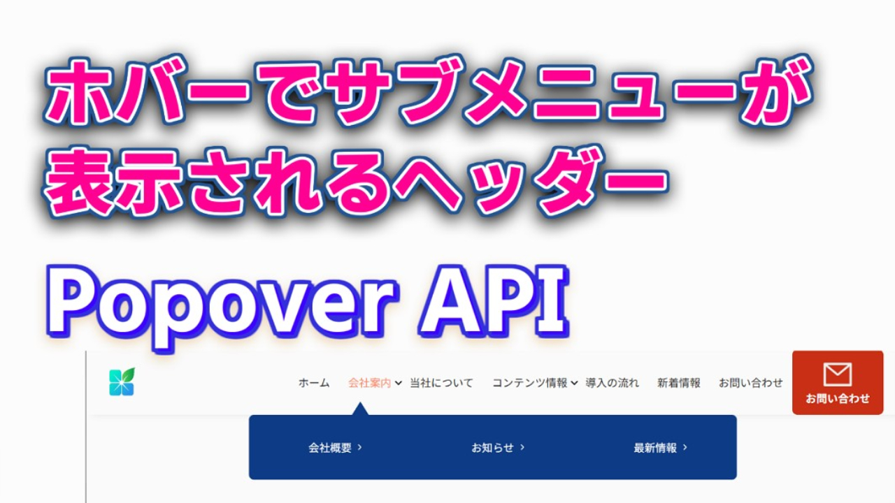
今回は下記のようなヘッダーを作成しました。。


Popover APIとは 簡単に言うと HTMLと少しのJavaScriptだけで
モーダルウィンドウやメニューを表示できる新しい機能です!
追加でライブラリを入れる必要なく
対応ブラウザもChrome、Edge、Safariなどになりました
この方法だとヘッダーでサブメニューを表示する設定が簡単にできます
今回、フォントサイズや空白サイズの調整は自作のclamp()計算ツールを使用して
画面サイズに応じて自動調整されるように設定してます。
今回は サブメニューが設定されてるメニューの下に三角矢印が出るようにしてるので
JavaScriptで表示非表示の管理を追加しました
これからのサイト作りに、絶対役立つ技術なので、ぜひ使いこなしていきましょう
HTMLを書く
まずは基本のHTML。
ボタンに popovertarget 属性、ポップオーバーに popover 属性をつけるだけ!
<!DOCTYPE html>
<html lang="ja">
<head>
    <meta charset="UTF-8">
    <meta name="viewport" content="width=device-width, initial-scale=1.0"/>
    <title>ポップオーバーのネスト</title>
    <link rel="stylesheet" href="./style.css">
</head>
<body>
    <div class="container">
        <header>
            <nav class="h-nav">
                <div class="logo-wrap">
                    <a href="#" class="logo">
                        <img src="./images/logo600.png" alt="ロゴ画像">
                    </a>
                </div>
                <ul class="navigation-list">
                    <li class="navigation-list-item"><a href="#">ホーム</a></li>
                    <li class="navigation-list-item popover-container popover-container-company">
                        <a href="#" class="arrow top-nav">会社案内</a>
                        <div class="popover popover-company" popover>
                            <ul class="child-list">
                                <li class="child-list-item popover-container">
                                    <a href="#" class="arrow arrow__right">会社情報</a>
                                </li>
                                <li class="child-list-item popover-container">
                                    <a href="#" class="arrow arrow__right">お知らせ</a>
                                </li>

                                <li class="child-list-item popover-container">
                                    <a href="#" class="arrow arrow__right">最新情報</a>
                                </li>
                            </ul>
                        </div>
                    </li>
                    <li class="navigation-list-item"><a href="#">当社について</a></li>
                    <li class="navigation-list-item popover-container">
                        <a href="#" class="arrow top-nav">コンテンツ情報</a>
                        <div class="popover popover-portfolio" popover>
                            <ul class="child-list">
                                <li class="child-list-item popover-container">
                                    <a href="#" class="arrow arrow__right">いのぷろチャンネル</a>
                                </li>
                                <li class="child-list-item popover-container">
                                    <a href="https://inomiti.com/w/" class="arrow arrow__right">いのみちブログ</a>
                                </li>
                                <li class="child-list-item popover-container">
                                    <a href="https://inopro.jpn.org/" class="arrow arrow__right">コーディング情報</a>
                                </li>
                            </ul>
                        </div>
                    </li>

                    <li class="navigation-list-item"><a href="#">導入の流れ</a></li>
                    <li class="navigation-list-item"><a href="#">新着情報</a></li>

                    <li class="h-nav-btn navigation-list-item">
                        <a href="#" class="h-nav-btntext">
                            <img src="./images/nav-mail.png" alt="メール">
                            <span>お問い合わせ</span>
                        </a>
                    </li>
                </ul>
            </nav>
        </header>
    </div>
    <script src="./main.js" defer></script>
</body>
</html>
CSSでスタイリング
次に、ポップオーバーが開いたときのデザインを整えます。
@charset "utf-8";

* {
  padding: 0;
  margin: 0;
}

body {
  font-family: sans-serif;
  font-size: 16px;
  color: #2f2f2f;
  background-color: #fafafa;
}

ul {
  list-style: none;
  border: none;
}

a {
  display: block;
  color: #2f2f2f;
  text-decoration: none;
  transition: color 0.1s;
  font-size: clamp(10px, 1.8051vw + -5.99px, 20px);
}

a:hover {
  color: #FE8964;
}

header {
  background: #fff;
  box-shadow: 10px 0 10px #e5e5e5;
}

.logo {
  max-width: 60px;
  max-height: 90px;
}

.logo img {
  width: 100%;
  height: auto;
  aspect-ratio: 60 / 50;
}

.h-nav {
  display: flex;
  align-items: center;
  height: 100px;
  padding: 0 24px;
  justify-content: space-between;
  max-width: 1440px;
  margin: 0 auto;
}

nav {
  height: 100%;
}

.navigation-list {
  display: flex;
  height: 100%;
}

.popover-container-company {
  position: relative;
}

.navigation-list-item > a {
  height: 100%;
  line-height: 100px;
  padding: 0 clamp(10px, 1.2635vw + -1.19px, 16px);
}

.child-list {
  display: flex;
  align-items: center;
  justify-content: space-around;
}

.child-list-item {
  height: 100px;
}

.popover-portfolio .child-list-item:first-child {
  margin-right: 20%
}

.child-list-item > a {
  height: 100%;
  padding: 0 12px;
  line-height: 100px;
  color: #fff;
  font-size: clamp(10px, 1.8051vw + -5.99px, 20px);
  transition: color 0.1s;
}

.child-list-item > a:hover {
  color: #FE8964;
}

.popover {
  width: 100%;
  border: none;
  background-color: #0d3b86;
}

.popover-portfolio {
  top: 100px;
  left: 0;
}

.arrow::after {
  display: inline-block;
  width: 20px;
  height: 20px;
  content: "";
  background: url(./images/arrow-down.svg);
  background-repeat: no-repeat;
  background-size: 22px;
  position: absolute;
  top: 50%;
  transform: translateY(-50%);
}

.top-nav {
  position: relative;
}

.top-nav::before {
  content: "";
  width: 0;
  height: 0;
  border-style: solid;
  border-color: transparent transparent #0d3b86 transparent;
  border-width: 0 16px 25px 16px;
  position: absolute;
  bottom: -5%;
  left: 35%;
  transform: translateX(-50%);
  visibility: hidden;
  opacity: 0;
}

.top-nav.show-before::before {
  visibility: visible;
  opacity: 1;
}

.arrow__right::after {
  display: inline-block;
  width: 18px;
  height: 18px;
  margin-left: 4px;
  content: "";
  background: url("./images/side-arrow.svg");
  background-repeat: no-repeat;
  background-size: 18px;
  position: absolute;
  top: 50%;
  transform: translateY(-50%);
}

.popover-company {
  position: absolute;
  max-width: 1000px;
  top: 100px;
  width: min(60%, 1000px);
  left: 50%;
  transform: translateX(-50%);
  border-radius: 8px;
}

.h-nav-btn {
  width: min(12vw, 140px);
  max-height: 100px;
}

.h-nav-btntext {
  display: flex;
  flex-direction: column;
  align-items: center;
  justify-content: center;
  background-color: #c92f14;
  color: white;
  font-weight: bold;
  border-radius: 8px;
  transition: transform 0.2s;
}

.h-nav-btntext img {
  width: 40%;
  height: auto;
  margin-bottom: 8%;
  margin-top: 2%;
}

.h-nav-btntext span {
  font-size: clamp(10px, 1.8051vw + -5.99px, 18px);
  line-height: 1;
}

.h-nav-btn a:hover {
  color: #fff;
}

.h-nav-btntext:hover {
  box-shadow: 4px 4px 6px 0 rgba(255, 255, 255, .5), -4px -4px 6px 0 rgba(116, 125, 136, .5), inset -4px -4px 6px 0 rgba(255, 255, 255, .2), inset 4px 4px 6px 0 rgba(0, 0, 0, .4);
}
Javascript
今回は▲マークの表示非表示のタイミングを調整するコード追加してます
const popoverContainers = document.querySelectorAll(".popover-container");
const withoutPopovers = document.querySelectorAll(
  ".navigation-list > li:not(.popover-container)"
);
const popovers = document.querySelectorAll(".popover");

popoverContainers.forEach((container) => {
  // マウス操作の制御
  container.addEventListener("mouseenter", () => openPopoverOf(container));
  container.addEventListener("mouseleave", () => closePopoverOf(container));
  // キーボード操作の制御
  container.addEventListener("focusin", () => openPopoverOf(container));
  withoutPopovers.forEach((item) => {
    item.addEventListener("focusin", () => closePopoverAll());
  });
});

const openPopoverOf = (container) => {
  // containerから一番近いポップオーバーを取得する
  const popover = container.querySelector(".popover");
  if (popover == null) {
    return;
  }
  // まだ開いていない場合だけshowPopoverを呼ぶ
  if (!popover.matches(":popover-open")) {
    popover.showPopover();
  }
};

const closePopoverOf = (container) => {
  // containerから一番近いポップオーバーを取得する
  const popover = container.querySelector(".popover");
  if (popover == null) {
    return;
  }
  // まだ閉じていない場合だけhidePopoverを呼ぶ
  if (popover.matches(":popover-open")) {
    popover.hidePopover();
  }
};

const closePopoverAll = () => {
  popovers.forEach((popover) => {
    // まだ閉じていないpopoverを全て閉じる
    if (popover.matches(":popover-open")) {
      popover?.hidePopover();
    }
  });
};


// 三角の表示制御
document.addEventListener('DOMContentLoaded', function () {
  const navItems = document.querySelectorAll('.popover-container');

  navItems.forEach((container) => {
    const topNav = container.querySelector('.top-nav');
    const popover = container.querySelector('.popover');

    if (!topNav || !popover) return;

    // ホバーでクラスを付与
    topNav.addEventListener('mouseenter', () => {
      topNav.classList.add('show-before');
    });

    topNav.addEventListener('mouseleave', () => {
      // popoverが表示されていなければクラスを外す
      if (!popover.matches(':popover-open')) {
        topNav.classList.remove('show-before');
      }
    });

    // Popover APIの状態に応じてクラスを切り替える
    popover.addEventListener('toggle', () => {
      if (popover.matches(':popover-open')) {
        topNav.classList.add('show-before');
      } else {
        topNav.classList.remove('show-before');
      }
    });
  });
});
今回のコードはこのサイトに記載のコードを参考にしてます。

コメント