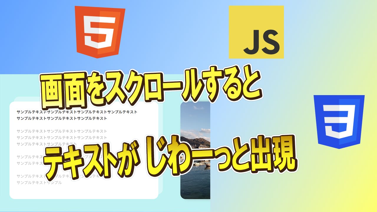
今回は画面をスクロールして指定の場所が表示される時に
テキストをフェードインで表示する方法を記事にしてみました。
レスポンシブも簡単に行ってます。
フォントは自作のフォントサイズ自動変更の値を使用してます。
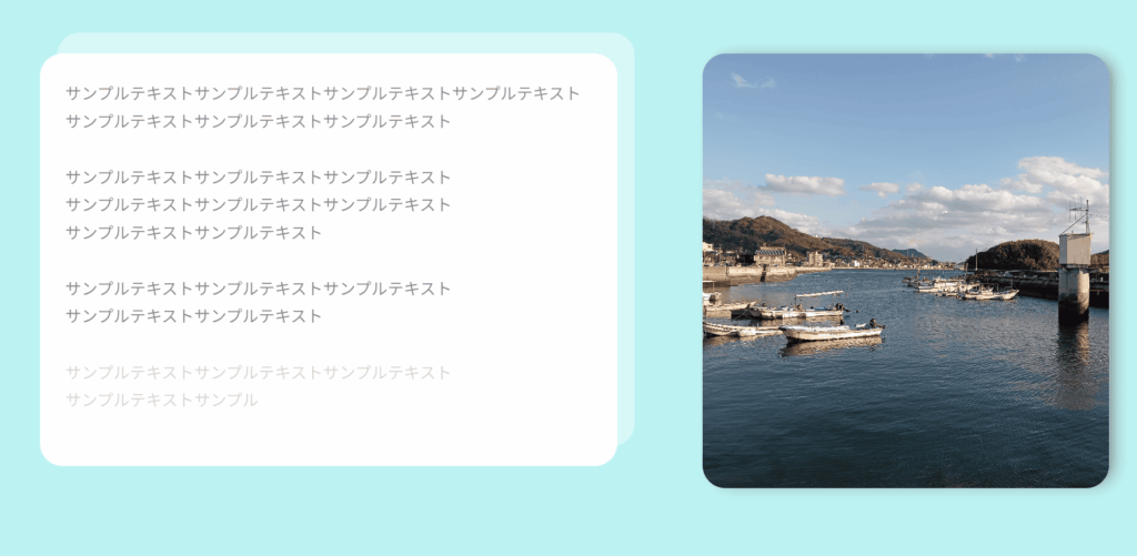
各セクションや画像はサンプル用で高さ固定で設定。
各デザイン等の設定はお好みでカスタマイズしてください。
さらに、この記事では エックスサーバー についても簡単に紹介しています。
実践的なコードを試す環境として、信頼できるレンタルサーバーをお探しの方は
ぜひチェックしてみてください!
HTML・CSS・JavaScriptにて作成してます。
今回のポイント
- スクロール位置に合わせてテキストがフェードイン
- レスポンシブ対応済み
- 自作のフォントサイズ自動変更スクリプトを使用
- 各セクションや画像はサンプル用で高さ固定
- HTML・CSS・JavaScriptで実装
今回実際に書いたコード
実際に書いたコードHTML
<!DOCTYPE html>
<html lang="ja">
<head>
    <meta charset="UTF-8">
    <meta name="viewport" content="width=device-width, initial-scale=1.0">
    <title>Document</title>
    <link rel="stylesheet" href="style.css">
</head>
<body>
    <section class="space container">
        スペース
    </section>
    <section>
    <div class="container">
      <div  id="about" class="about-inner">
        <div class="about-image">
          <img src="./img/about-1.jpg" alt="inoue画像">
        </div>


        <div class="about-content">
          <p class="about-text js-mission">
            サンプルテキストサンプルテキストサンプルテキストサンプルテキスト
            <br>
            サンプルテキストサンプルテキストサンプルテキスト
          </p>

          <p class="about-text js-mission">
            サンプルテキストサンプルテキストサンプルテキスト<br>
            サンプルテキストサンプルテキストサンプルテキスト<br>
            サンプルテキストサンプルテキスト
          </p>

          <p class="about-text js-mission">
            サンプルテキストサンプルテキストサンプルテキスト<br>
            サンプルテキストサンプルテキスト
          </p>

          <p class="about-text js-mission">
            サンプルテキストサンプルテキストサンプルテキスト<br>
            サンプルテキストサンプル
          </p>
        </div><!-- /.about-text -->
      </div><!-- /.about-inner -->
    </div><!-- /.container -->
  </section><!-- /.about -->
      <section class="space container">
        スペース
    </section>
          <section class="space container">
        スペース
    </section>
          <section class="space container">
        スペース
    </section>
          <section class="space container">
        スペース
    </section>
          <section class="space container">
        スペース
    </section>
  <script src="main.js"></script>
</body>
</html>
実際に書いたコードCSS
@charset "utf-8";

/* ====================
about
=================== */
* {
    margin: 0;
    padding: 0;
    box-sizing: border-box;
}

body {
    background-color: rgb(190, 243, 243);
}

section{
	padding: 100px 0 0 0;
}

.container{
	width: calc(100% - 100px);
	max-width: 1500px;
	margin: 0 auto;
}

.space {
    height: 500px;
}

.about-inner {
  position: relative;
  display: flex;
  justify-content: space-between;
  flex-direction: row-reverse;
  height: 380px;
}

.about-image {
  width: 33%;
  height: auto;
}

.about-image img {
  width: 100%;
  height: 100%;
  border-radius: 20px;
  object-fit: cover;
  vertical-align: bottom;
  box-shadow: 7px 0px 15px -5px #777777;
}

.about-content {
  width: 54%;
  padding: clamp(20px, 4.0000vw + -20.00px, 40px);
  background-color: rgb(255, 255, 255);
  border-radius: 20px;
  position: absolute;
  top: 0;
  left: 0;
  z-index: 1;
}

.about-content::before {
  content: "";
  width: 100%;
  height: 100%;
  border-radius: 20px;
  background-color: rgba(255, 255, 255, 0.4);
  position: absolute;
  top: -5%;
  left: 3%;
  z-index: -1;
}


.about-text {
  font-size: clamp(14px, 0.4000vw + 10.00px, 16px);
  line-height: 1.7;
  margin-bottom: 25px;
  opacity: 0;
  transition: opacity 7s ease;
  position: relative;
  z-index: 5;
}

.slidin.about-text {
  opacity: 1;
}

/* ===========================
レスポンシブ about
============================ */
@media screen and (max-width:1190px) {
  .about-image {
    width: 38%;
  }
}

@media screen and (max-width:860px) {
  .about-inner {
    display: block;
    position: static;
  }

    .about-image {
    display: none;
  }

  .about-content {
    width: 100%;
    position: static;
  }

  .about-content::before {
    display: none;
  }
}

@media screen and (max-width:767px) {
  .container{
    width: calc(100% - 60px);
  }

  .about-content {
    padding: 2.5rem;
  }
}
実際に書いたコードJavaScript
/* ===========================
misssionのスライドイン
============================ */
document.addEventListener("DOMContentLoaded", function() {
  function checkVisibility() {
    const windowWidth = window.innerWidth;
    const jsMissionElements = document.querySelectorAll('.js-mission');

    jsMissionElements.forEach(element => {
      const elementTop = element.getBoundingClientRect().top + window.scrollY;
      const elementBottom = elementTop + element.offsetHeight;
      const viewportTop = window.scrollY;
      const viewportBottom = viewportTop + window.innerHeight;

      // 要素がビューポートに入った場合
      if (elementTop < viewportBottom && elementBottom > viewportTop) {
        element.classList.add('slidin');
      } else {
        element.classList.remove('slidin');
      }
    });
  }

  window.addEventListener('scroll', checkVisibility);
  window.addEventListener('resize', checkVisibility);
  checkVisibility(); // 初期チェック
});
今回は スクロール時にテキストをフェードインで表示する 実装例を紹介しました。
実際にコードを動かしながら、デザイン調整なども楽しんでみてください!
疑問や「こうしたい!」というリクエストがあれば、お気軽にコメントしてくださいね😊

コメント