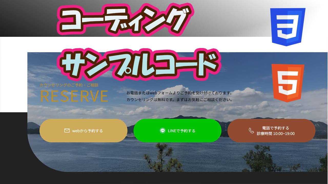
今回はページの中でお問い合わせボタン等を配置するデザインで
画像の上にボタン等配置して画像の後ろにアクセントカラーを配置するコードかいてみました。
今回作成したのはこんな感じになりました。
HTMLとCSSで作成してます。
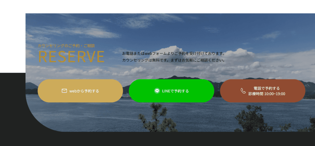
簡単なレスポンシブ設定もおこないました。
今回書いたコードも記載しました。
よかったら参考にしてください。
今回書いたコード
HTMLコード
<!DOCTYPE html>
<html lang="ja">
<head>
    <meta charset="UTF-8">
    <meta name="viewport" content="width=device-width, initial-scale=1.0">
    <title>Document</title>
    <link rel="stylesheet" href="style.css">
</head>
<body>
    <section class="contact">
        <div class="inner">
            <div class="contact-title">
                <div class="title">
                    <h2>カウンセリングのご予約・ご相談</h2>
                    <p class="en">RESERVE</p>
                </div>
                <p>お電話またはwebフォームよりご予約を受け付けております。<br>カウンセリングは無料です。まずはお気軽にご相談ください。</p>
            </div>
            <div class="contact-contents">
                <div class="contact-content web">
                    <a href="#" target="_blank">
                        <img src="imgs/mail_40.svg" alt="web予約">
                        <p>webから予約する</p>
                    </a>
                </div>

                <div class="contact-content line">
                    <a href="#" target="_blank">
                        <img src="imgs/line-50.png" alt="LINE予約">
                        <p>LINEで予約する</p>
                    </a>
                </div>

                <div class="contact-content tel">
                    <a href="#" target="_blank">
                        <img src="imgs/tel-icon.svg" alt="電話予約">
                        <p>電話で予約する<span>診療時間 10:00~19:00</span></p>
                    </a>
                </div>
            </div>
        </div>
    </section>

    <section class="space s-bottom"></section>
</body>
</html>
CSSコード
@charset "utf-8";

* {
    margin: 0;
    padding: 0;
    box-sizing: border-box;
}

.contact {
    position: relative;
    margin-top: 10rem;
    z-index: 4;
}

.contact::before {
    position: absolute;
    content: "";
    background: #222;
    bottom: -1px;
    left: 0;
    width: 100%;
    height: 50%;
}

.contact .inner {
    position: relative;
    width: calc(100% - 100px);
    left: 100px;
    max-width: 100%;
    padding: clamp(60px, 11.5090vw + -28.39px, 150px) clamp(20px, 3.8363vw + -9.46px, 50px);
}

.contact .inner::before {
    position: absolute;
    content: "";
    top: 0;
    right: 0;
    background: url(imgs/img-3.jpg);
    background-repeat: no-repeat;
    background-position: center;
    background-size: cover;
    overflow: hidden;
    width: 100%;
    height: 100%;
    filter: brightness(0.7);
    border-radius: 0 0 0 clamp(110px, 8.9514vw + 41.25px, 180px);
}

.contact-title {
    position: relative;
    max-width: 1000px;
    margin: 0 auto;
    display: flex;
    align-items: flex-end;
    gap: clamp(40px, 5.1151vw + 0.72px, 80px);
}

@media screen and (max-width: 863px) {
    .contact-title {
        flex-wrap: wrap;
    }
}

.contact-title h2 {
    color: #b88e2c;
    font-size: clamp(12px, 0.5115vw + 8.07px, 16px);
    font-weight: 500;
}

.contact-title .en {
    font-size: clamp(40px, 3.8363vw + 10.54px, 70px);
    font-weight: 400;
    letter-spacing: 2px;
    line-height: 1;
    display: block;
    color: #b88e2c;
}

.contact-title p {
    font-size: clamp(10px, 0.7673vw + 4.11px, 16px);
    line-height: 1.8;
}

.contact-contents {
    display: grid;
    grid-template-columns: repeat(3,1fr);
    z-index: 2;
    max-width: 1000px;
    gap: clamp(10px, 2.8133vw + -11.61px, 32px);
    margin: clamp(38px, 4.8593vw + 0.68px, 76px) auto 0;
}

@media screen and (max-width: 767px) {
    .contact-contents {
        grid-template-columns: none;
        grid-template-rows: repeat(3, 1fr);
        gap: 20px;
    }
}

.contact-content {
    position: relative;
}

.contact-content a {
    display: flex;
    align-items: center;
    justify-content: center;
    text-align: center;
    border-radius: 9999px;
    text-decoration: none;
    color: #ffffff;
    transition: .6s cubic-bezier(0.19, 1, 0.22, 1);
    height: clamp(70px, 3.8363vw + 40.54px, 100px);
}

.contact-content a img {
    aspect-ratio: 1 / 1;
    margin-right: .5rem;
    width: clamp(20px, 0.5115vw + 16.07px, 24px);
}

img {
    width: 100%;
    height: auto;
}

.contact-content.web a {
    background: #cdab5a ;
}

.contact-content.line a {
    background: #00c300;
}

.contact-content.tel a {
    background: #904b31;
}

.contact-content a p {
    font-size: clamp(11px, 0.3836vw + 8.05px, 14px);
    color: #ffffff;
}

.contact-content a p span {
    display: block;
    font-size: clamp(8px, 0.3836vw + 8.05px, 14px);
    letter-spacing: .05px;
}

.space {
    height: 200px;
    background-color: #222;
}


コメント