
ナビゲーションバー(nav)の作成方法はいろいろあります。
今回はその一例
navをulのliで作成して、liをinline-blockにすると
横並びになるのでその方法で、作成。
横並びのレイアウトには、calcで均等配置してます。
今回作成したnavの図はこちら
ナビゲーション全体
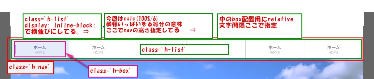
各リストの表示方法
今回作成したコードはこちら
HTML
  <body>
    <nav class="h-nav">
      <ul class="h-menu">
        <li class="h-list">
          <a href="#">
            <div class="h-box">
              <div class="h-top">
                ホーム
              </div><!-- /.h-top -->
              <div class="h-bottom">
                HOME
              </div><!-- /.h-bottom -->
            </div><!-- /.h-box -->
          </a>
        </li><!-- /.h-list -->
      </ul>
    </nav><!-- /.h-nav -->
  </body>
CSS
.h-nav {
  border-top: 1px solid #d2d2d2;
  border-bottom: 1px solid #d2d2d2;
  }
  .h-menu {
  margin: 0;
  padding: 0;
  letter-spacing: -.4em;
  }
  .h-list {
  display: inline-block;
  width: calc(100%/6);
  position: relative;
  letter-spacing: normal;
  height: 64px;
  border-right: 1px solid #d2d2d2;
  box-sizing: border-box;
  vertical-align: bottom;
  }
  .h-menu:first-child {
  border-left: 1px solid #d2d2d2;
  }
  .h-list:hover .h-top {
  color: #0e36ca;
  }
  .h-list:hover {
  background-color: #e6ebfa;
  }
  .h-list:hover .h-box:before {
  content: "";
  width: 3px;
  height: 100%;
  position: absolute;
  background-color: #0e36ca;
  left: 4px;
  }
  .h-box {
  position: absolute;
  top: 50%;
  left: 50%;
  transform: translate(-50%, -50%);
  width: 90%;
  text-align: center;
  }
  .h-top {
  font-size: 15px;
  color: #666;
  margin-bottom: 4px;
  }
  .h-bottom {
  font-size: 10px;
  color: #bababa;
  text-align: center;
  }
今回はh-list
display: inline-block;で横並び
width: calc(100%/6);
ここは、横幅全幅を6等分で配置。
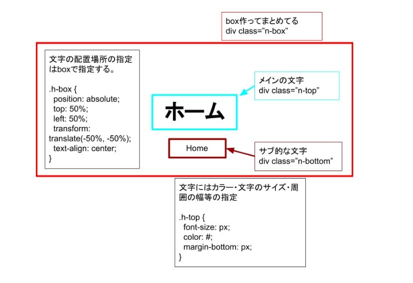
h-boxを配置する為
position: relative;設定。
今回、文字が2段で配置したいので、
その2文字を、h-boxで囲むことで動かしやすい。
transform: translate(-50%, -50%);
で中央配置にしてる。
navの文字の配置や場所の指定は、文字を囲んでる
h-boxで指定する。
文字のカラーやサイズ。
上下間のスペースはh-topで指定。
position: absolute;を指定すると、その要素は高さが
認識されないので、親要素で高さの指定をする。
navをinline-blockとcalcを使って作成は以上です。
よかったら、参考にしてください。
CodePen での確認はこちら


コメント