HTML/CSS 文字を画像などの境目で左右違う色に変更する方法。
何パターンか記事にしてみました。
今回は画像の位置がずれると、色の変更部分も
ズレていく感じで出来ました。
この辺は、サンプルコードも書いときますので、
色々数値変更してやってみてください。
完成したものは下記になります。
単純な境目で文字の色が変わる。
もう1個違う基本パターン
右側の画像のサイズ変更して上にかぶせた感じ
今回何パターンか作ってみたので書いときます。
パソコン環境によっては多少挙動が違って見える場合があります。
その場合は、微調整お願いいたします。
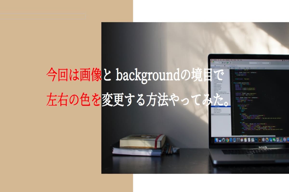
単純な境目で文字の色が変わる。
まずは、基本形の左右の色違いのコンテンツがあり
その上の文字が切れ目で左右違う色にする設定。
書いたコードはこちら
HTML
<body>
  <h1 class="settei-title">1.単純に文字のかさね</h1>
  <section class="kensyou">
    <div>
      <h2 class="text-black">
        今回は画像とbackgroundの境目で <br>
        左右の色を変更する方法やってみた。
      </h2>
    </div>
    <div>
      <h2 class="text-white">
        今回は画像とbackgroundの境目で <br>
        左右の色を変更する方法やってみた。
      </h2>
    </div>
  </section>
</body>
CSS
* {
  margin: 0;
  padding: 0;
  box-sizing: border-box;
}

.settei-title {
  color: black;
  margin: 100px 0;
  font-size: 48px;
  text-align: center;
}

section {
  position: relative;
  width: 100%;
  max-width: 1200px;
  height: 100vh;
  display: flex;
  margin: auto;
  overflow: hidden;
}

section div {
  position: relative;
  width: 40%;
  background: #b6d67f;
  overflow: hidden;
}

section div h2 {
  position: absolute;
  white-space: pre;
  font-size: 40px;
  font-weight: bold;
}

section div:nth-child(2) {
  position: relative;
  width: 60%;
  background: url(http://inomiti.com/a/lnk/256/);
  background-position: center;
  background-size: cover;
  overflow: hidden;
}


.text-black {
  color: black;
  top: 25%;
  left: 40%;
}
.text-white {
  color: #ffffff;
  top: 25%;
  left: -40%;
}
私が一番最初に、この効果のやり方探した時に
一番カスタマイズしやすかったのがこのパターンでした。
これで文字が変わっていきます。
細かい設定等はいろいろいじってみてください。
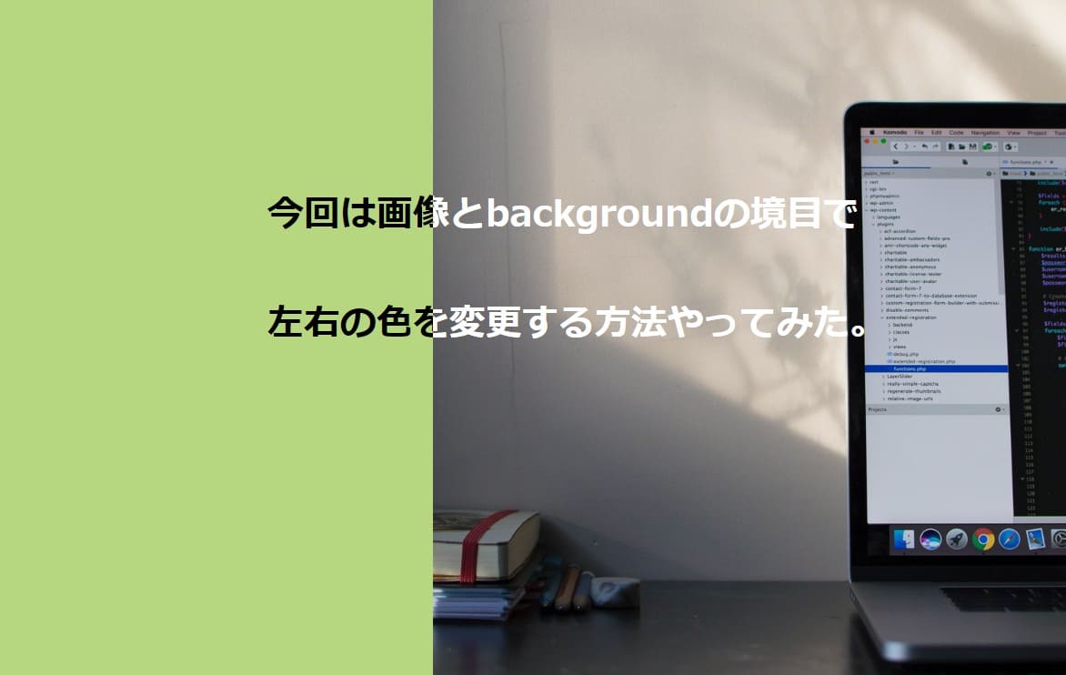
もう1個違う基本パターン
基本のパターン:afterを使った方法。
もう1つが、::after要素を使ったやり方です。
この方法でも可能でした。
こちらも画像のサイズ変更して、重ね効果してます。
書いたコードがこちら
HTML
  <section class="content">
    <div class="h-inner">
      <div class="outer">
        <div class="black">今回は画像と backgroundの境目で <br>左右の色を変更する方法やってみた。</div>
        <div class="red"></div><!-- /.white -->
      </div>
    </div>
  </section>
CSS
.h-inner {
  width: 100%;
  height: 100vh;
  background: linear-gradient(90deg, #D3B893 50%, #ffffff 50% );
/*   padding-bottom: 61px; */
}

.outer {
  position:relative;
  background-image: url(http://inomiti.com/a/lnk/256/);
  background-size: 60% 500px;
  background-repeat:  no-repeat;
  background-position: right;
  top: 25%;
}

.black {
  color: black;
  position: absolute;
  left: 350px;
  top: 130px;
  font-size: 48px;
  font-weight: bold;
  line-height: 1.7;
  white-space: pre;
}

.red {
  position: relative;
  width: 40%;
  height: 500px;
  overflow: hidden;
}

.red::after{
  position:absolute;
  left:350px;
  top: 130px;
  content:"今回は画像と backgroundの境目で\A左右の色を変更する方法やってみた。";
  white-space: pre;
  font-size:48px;
  font-weight:bold;
  line-height: 1.7;
  color: red;
}
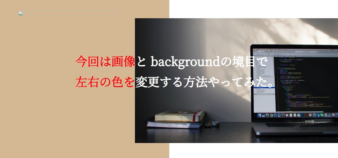
文字が横に動くアニメーションパターン
アニメーションなのでCodePen載せときます。
文字の折り返し位置と、スタート位置の調整。
@keyframes animate {
100% {
transform: translateX(-50%);
}
この部分の数値の場所まで文字が流れる。
スタート位置は、.text-black .text-whiteそれぞれの
leftの数値で調整しました。
書いたコードはこちら
HTML
<body>
  <section class="content">
    <div>
      <h2 class="text-black">
        今回は画像とbackgroundの境目で <br>
        左右の色を変更する方法やってみた。
      </h2>
    </div>
    <div>
      <h2 class="text-white">
        今回は画像とbackgroundの境目で <br>
        左右の色を変更する方法やってみた。
      </h2>
    </div>
  </section>
</body>
CSS
* {
  margin: 0;
  padding: 0;
  box-sizing: border-box;
}


section {
  position: relative;
  width: 100%;
  max-width: 1200px;
  height: 100vh;
  display: flex;
  margin: auto;
  overflow: hidden;
}

section div {
  position: relative;
  width: 50%;
  background: #b6d67f;
  overflow: hidden;
}

section div h2 {
  position: absolute;
  white-space: pre;
  font-size: 40px;
  font-weight: bold;
  animation: animate 5s linear infinite;
}

@keyframes animate {
  0% {
    transform: translateX(0);
  }
  100% {
    /* 折り返し位置の指定 */
    transform: translateX(-55%);
  }
}

section div:nth-child(2) {
  position: absolute;
  width: 60%;
  background: pink;
  background-size: cover;
  overflow: hidden;
  height: 80vh;
  margin-top: 43px;
  right: 0;
}

.text-black {
  color: black;
  top: 25%;
  /* ここで文字の最初指定 */
  left: 60%;
}
.text-white {
  color: #ffffff;
  top: 25%;
  /* ここで文字の最初指定 */
  left: -17%;
}
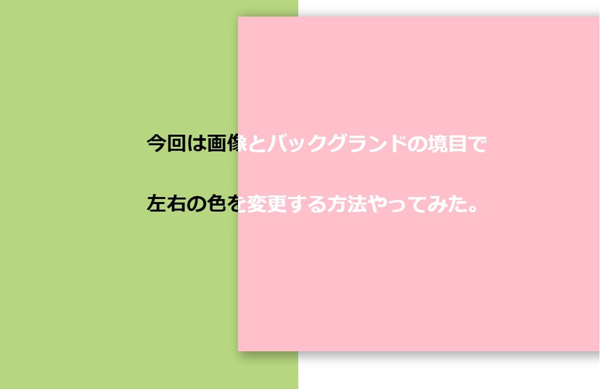
右側の画像のサイズ変更して上にかぶせた感じ
左右の画像の重なり入れて、その重なり部分で文字の色が
変わる設定にしてます。
画像の重なりで、widthの割合変えてるので、文字の配置
の微調整が必要になった。
右側の画像を浮かせるために、position: relative;を
position: absolute;に変更してる。
box-shadowを使用して、BOXに影つけてる。
書いたコードはこちらになります。
HTML
<body>
  <section class="content">
    <div>
      <h2 class="text-black">
        今回は画像とバックグランドの境目で <br>
        左右の色を変更する方法やってみた。
      </h2>
    </div>

    <div>
      <h2 class="text-white">
        今回は画像とバックグランドの境目で <br>
        左右の色を変更する方法やってみた。
      </h2>
    </div>
  </section>
</body>
CSS
* {
  margin: 0;
  padding: 0;
  box-sizing: border-box;
}


section {
  position: relative;
  width: 100%;
  max-width: 1400px;
  height: 100vh;
  display: flex;
  margin: auto;
  overflow: hidden;
}

section div {
  position: relative;
  width: 50%;
  background: #b6d67f;
  overflow: hidden;
}

section div h2 {
  position: absolute;
  white-space: pre;
  font-size: 40px;
  font-weight: bold;
}


section div:nth-child(2) {
  position: absolute;
  width: 60%;
  background: pink;
  background-size: cover;
  overflow: hidden;
  height: 80vh;
  margin-top: 43px;
  right: 0;
  box-shadow: 10px 5px 20px 6px rgba(0,0,0,0.3);
}

.text-black {
  color: black;
  top: 25%;
  left: 32%;
}
.text-white {
  color: #ffffff;
  top: 25.5%;
  left: -40%;
}
YouTube動画にもしてみました
これからコーディング動画アップしていく予定ですので、
よかったらチャンネル登録お願いいたします。


コメント