今回は、CSSで文字の下に線を引く方法を1つ書いていきます。
下線をつけたいテキストに、疑似要素beforeを使います。
CSSで文字の下に線を入れるのは、border-bottomで指定すれば
線を入れることができます。
ただ線の太さや色の指定はできるが、長さの指定はこの方法では
出来ません。
なので、要素のサイズに合わせた長さになります。
今回、下記のようなテキストの下にサイズの短い線を入れたいと
思い探してたら、あったのでその方法になります。

方法は疑似要素のbeforeを使えば簡単に出来ます。
是非マスターしてください。
実際に書いたコード公開
上記の画像の場合に書いたコード
HTML
<body>
  <div class="m-titlebox">
    <img class="m-img" src="./images/logoc.png" alt="">
    <h2 class="m-h2">事業内容</h2><!-- /.m-h2 -->
  </div><!-- /.m-titlebox -->
</body>
CSS
* {
  margin: 0;
  padding: 0;
  box-sizing: border-box;
}


.m-titlebox {
  max-width: 145px;
  margin: auto;
  margin-bottom: 100px;
  text-align: center;
}

.m-img {
  width: 100%;
  object-fit: cover;
}
.m-h2 {
  position: relative;
  display: inline-block;
  margin-bottom: 5px;
  font-size: 36px;
  font-weight: 500;
  color: #000000;
}

.m-h2::before {
  content: '';
  position: absolute;
  left: 50%;
  /*線の位置
  bottomで下線 topで上線*/
  bottom: -3px;
  display: inline-block;
  /*線の横の長さ*/
  width: 60%;
  /*線の太さ*/
  height: 5px;
  /*センターの位置調整*/
  -webkit-transform: translateX(-50%);
  transform: translateX(-50%);
  background-color: #275B0D;
  border-radius: 2px;
}
このコードで、
left: 50%;
transform: translateX(-50%);で左右中央
/*線の横の長さ*/ width: 60%;
で横幅の設定が可能になります。
/*線の太さ*/ height: 5px;
で線の縦幅のせっていが可能になります。
/*線の位置 bottomで下線 topで上線*/ bottom: -3px;
このコードでは、線の配置を文字の上にするか下にするかの指定。
topで文字の上 bottomで文字の下に配置可能。
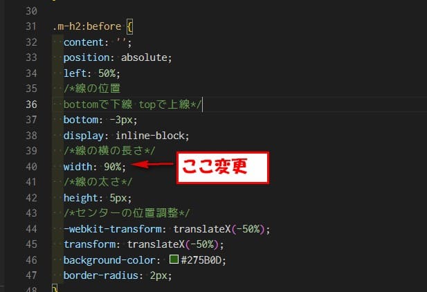
この線の長さと配置の設定変更したのはこちらになります。
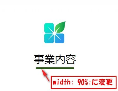
線の長さを90%に変更
これで、文字の横幅に対して90%のサイズになります。
書いたコード。HTMLは変更なし
CSS
* {
  margin: 0;
  padding: 0;
  box-sizing: border-box;
}


.m-titlebox {
  max-width: 145px;
  margin: auto;
  margin-bottom: 100px;
  text-align: center;
}

.m-img {
  width: 100%;
  object-fit: cover;
}
.m-h2 {
  position: relative;
  display: inline-block;
  margin-bottom: 5px;
  font-size: 36px;
  font-weight: 500;
  color: #000000;
}

.m-h2::before {
  content: '';
  position: absolute;
  left: 50%;
  /*線の位置
  bottomで下線 topで上線*/
  bottom: -3px;
  display: inline-block;
  /*線の横の長さ*/
  width: 90%; /*←ここ変更してる*/
  /*線の太さ*/
  height: 5px;
  /*センターの位置調整*/
  -webkit-transform: translateX(-50%);
  transform: translateX(-50%);
  background-color: #275B0D;
  border-radius: 2px;
}
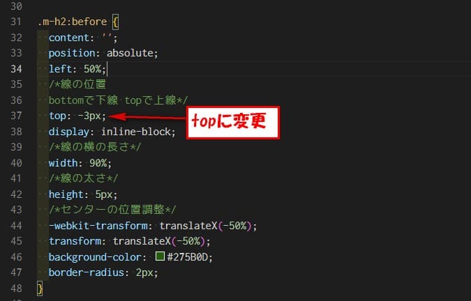
線に配置を文字の上に変更
この指定で数値を-指定すると、文字から離れていきます。
今回は、top: -3px;に変更したので。文字から3px上に配置されます。

書いたコード。HTMLは変更なし
CSS
* {
  margin: 0;
  padding: 0;
  box-sizing: border-box;
}


.m-titlebox {
  max-width: 145px;
  margin: auto;
  margin-bottom: 100px;
  text-align: center;
}

.m-img {
  width: 100%;
  object-fit: cover;
}
.m-h2 {
  position: relative;
  display: inline-block;
  margin-bottom: 5px;
  font-size: 36px;
  font-weight: 500;
  color: #000000;
}

.m-h2::before {
  content: '';
  position: absolute;
  left: 50%;
  /*線の位置
  bottomで下線 topで上線*/
  top: -3px;  /*←ここ変更してる*/
  display: inline-block;
  /*線の横の長さ*/
  width: 60%;
  /*線の太さ*/
  height: 5px;
  /*センターの位置調整*/
  -webkit-transform: translateX(-50%);
  transform: translateX(-50%);
  background-color: #275B0D;
  border-radius: 2px;
}
リンク
リンク


コメント