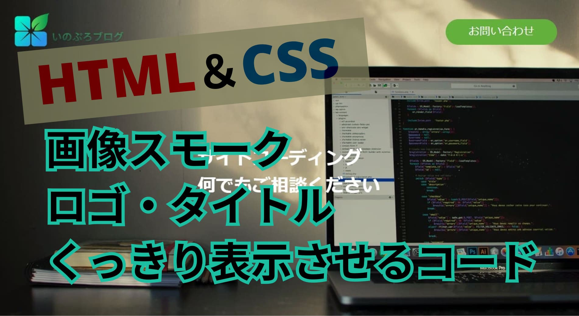
CSS で画像にスモーク効果をあてるのは簡単で、
いろんなパターンがあります。
この記事では、トップ画像にスモーク効果つけて、ロゴやタイトル入れると
ロゴやタイトルにもスモーク効果がついて見にくくなった。
それを解消するコードの書き方1つ見つけたので、記事にしました。
でも、ヘッダー画像などに使って、文字・ロゴ・ナビ・ボタンなど
を入れようとすると、文字等にもスモークがかかる。
最初は、position: absolute;使って、画像のトップに
ロゴやナビ配置してみた。
パソコン表示の場合は問題ない感じ。
でもレスポンシブで、ロゴやボタンの位置などの操作が
ちょっと難しくなった。
そこで今回 画像のトップにロゴやナビ配置するのを、
position: absolute;を使うのじゃなく、他の方法で
出来ないか何パターンかやってみた。
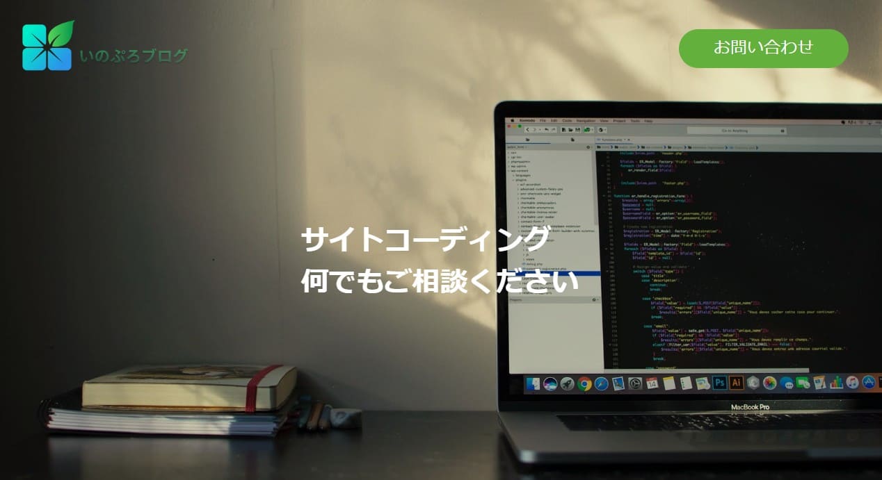
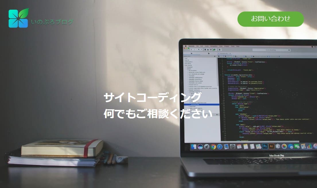
実際にうまく出来た方法
何パターンかやってみた結果。
このパターンだと今回うまく出来ました。
その方法がこれになります。
background-image: url(../imgs/top.jpg);
background-color: rgba(0, 0, 0, 0.25);
background-blend-mode: overlay;
今回は、ロゴ・ナビ・文字のコードを普通に書いて、
それを、今回は class=”header” 囲んで、そこに
background-imageで画像表示
background-color: rgba(0, 0, 0, 0.25);
background-blend-mode: overlay;
でスモークをつけるようにしたら出来ました。
実際に書いたコード
HTML
      <header class="header">
        <div class="header-inner">
          <div class="h-title-box">
            <div class="h-title">
              <a href=""><img class="h-logo" src="http://inomiti.com/a/lnk/inologo/" alt="logo"></a>
            </div><!-- /.h-title -->
            <div class="m-btnbox h-btn-botom">
              <a href="#otoiawase" class="h-btn-text">お問い合わせ</a>
            </div>
          </div><!-- /.h-title-box -->
          <div class="h-box">
            <h2 class="h-h2">サイトコーディング<br>
              何でもご相談ください</h2><!-- /.h-h2 -->
          </div><!-- /.h-box -->
        </div><!-- /.header-inner -->
      </header><!-- /.header -->
CSS
.header {
  position: relative;
  width: 100%;
  background-image: url(http://inomiti.com/a/lnk/256/);
  /* background-color: #404040; */
  background-color: rgba(245, 205, 241, 0.25);
  background-blend-mode: overlay;
  background-size: cover;
  margin-bottom: 50px;
}

.header-inner {
  width: 100%;
  max-width: 1500px;
  margin: auto;
  height: 700px;
}

.h-title-box {
  max-width: 1500px;
  display: flex;
  justify-content: space-between;
  align-items: center;
  padding: 30px 50px 0 30px;
}

.h-title {
  width: 250px;
}
.h-title img {
  max-width: 100%;
  object-fit: cover;
}

/* お問い合わせボタン */
.m-btnbox a {
  display: inline-block;
  color: #fff;
  font-size: 24px;
  text-decoration: none;
  padding: 10px 50px;
  background: #63B13C;
  border-radius: 30px;
}

.m-btnbox a:hover {
  color: #333;
  transition:0.5s;
  background: #c4e6b6;
  transition:0.5s;
}

.h-h2 {
  position: absolute;
  color: #fff;
  font-size: 40px;
  top: 50%;
  left: 50%;
  transform: translate(-50%,-50%);
}


@media (max-width:1170px) {
.header-inner {
    height: 600px;
  }

  @media (max-width:820px) {
.header-inner {
  height: 550px;
}
  .h-btn-text {
  font-size: 20px;
}
.h-h2 {
  font-size: 35px;
}


@media (max-width:720px) {

.h-h2 {
font-size: 28px;
}

@media (max-width:600px) {

.header-inner {
  height: 500px;
}
.h-btn-botom {
  position: absolute;
  bottom: 30px;
  left: 50%;
  transform: translateX(-50%);
  margin: auto;
}
.h-btn-text {
  font-size: 15px;
  padding: 8px 20px;
}
.h-h2 {
  font-size: 23px;
}


 @media (max-width:480px) {
  .header-inner {
    height: 450px;
  }

  .header {
    background-color: rgba(0, 0, 0, 0.15);
  }

.h-h2 {
  width: 80%;
  text-align: center;
  font-size: 20px;
}

@media (max-width:340px) {

  .header-inner {
    height: 400px;
  }
.h-title {
  width: 150px;
}
.h-btn {
  width: 80%;
  margin: 250px auto 0 auto;
}

.m-btnbox a {
  font-size: 14px;
  padding: 15px 25px;
}
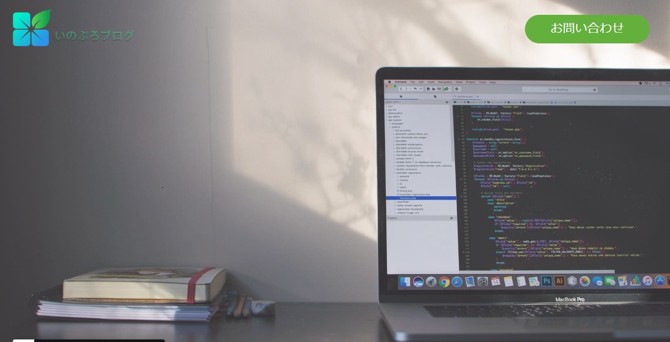
今回はこの書き方で、画像にスモーク効果あてて
文字にスモークがかかることなく表示することが出来た。
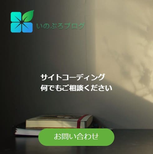
今回の方法は、スマホ画面になった時に、
ロゴとお問い合わせボタンを、画像の上下の端に配置したので
こんな感じになりました。
ハンバーガーメニューやボタンを消す場合は、
また違う方法でも可能になります。
もう一つうまくいった方法
こっちの方法でも、出来ました。
    <header class="header1">
      <div class="header-inner1">
      <div class="h-title-box1">
        <div class="h-title1">
          <a href=""><img class="h-logo1" src="./img/logo.png" alt="logo"></a>
        </div><!-- /.h-title -->
        <div class="m-btnbox1 h-btn-botom1">
          <a href="#otoiawase" class="h-btn-text1">お問い合わせ</a>
        </div>
      </div><!-- /.h-title-box -->
      <div class="h-box1">
        <h2 class="h-h2">外構工事のことなら<br>
          何でもご相談ください</h2><!-- /.h-h2 -->
      </div><!-- /.h-box -->
    </div><!-- /.header-inner -->
    </header><!-- /.header -->
.header1 {
  /* position: relative; */
  width: 100%;
  background-image: url(http://inomiti.com/a/lnk/256/);
  background-color: #8d8d8c;
  background-blend-mode: overlay;
  background-size: cover;
  background-position: center;
  margin-bottom: 50px;
}

.header-inner1 {
  max-width: 1500px;
  margin: auto;
  height: 700px;
}
.h-smork {
  width: 100%;
  height: 100%;
  background: #000000;
  opacity: 0.25;
}

.h-title-box1 {
  max-width: 1500px;
  display: flex;
  justify-content: space-between;
  align-items: center;
  padding: 30px 50px 0 30px;
}

.h-title1 {
  width: 250px;
}
.h-title1 img {
  max-width: 100%;
  object-fit: cover;
}

/* お問い合わせボタン */
.m-btnbox1 a {
  display: inline-block;
  color: #fff;
  font-size: 24px;
  text-decoration: none;
  padding: 10px 50px;
  background: #63B13C;
  border-radius: 30px;
}

.m-btnbox1 a:hover {
  color: #333;
  transition:0.5s;
  background: #c4e6b6;
  transition:0.5s;
}

.h-box1 h2 {
  position: absolute;
  color: #fff;
  font-size: 48px;
  top: 50%;
  left: 50%;
  transform: translate(-50%,-50%);
}
別のうまくいかなかった例
この方法は、画像を background-image で入れるんじゃなく、
imgとしてHTMLの方で、画像指定してる方法です。
この方法ですると、ロゴとボタンを、position: absolute;
で配置する必要があります。
ただ、ロゴとボタンのまとまりをposition: absolute;で指定すると
display: flex;が効かなかった。
ロゴとボタンそれぞれ個別で、position: absolute;で場所指定
して配置してみました。
この方法だと。画像が広がった時に、ロゴとボタンも追従して
外に広がっていってしまう状態になる。
書いたコード
HTML
    <section class="sita-box">
          <p class="colorfilter-base">
      <img src="http://inomiti.com/a/lnk/256/" alt="カラーフィルタ効果の対象画像" class="colorfilter-image">
  </p>
      <div class="h-title-box2">
        <div class="h-title2">
          <a href=""><img class="h-logo" src="http://inomiti.com/a/lnk/inologo/" alt="logo"></a>
        </div><!-- /.h-title -->
        <div class="m-btnbox2 h-btn-botom">
          <a href="#otoiawase" class="h-btn-text">お問い合わせ</a>
        </div>
      </div><!-- /.h-title-box -->

</section><!-- /.sita-box -->
CSS
.h-title2 {
  width: 250px;
}

.h-title2 {
  position: absolute;
  top: 30px;
  left: 30px;
  width: 250px;
}
.h-title2 img {
  max-width: 100%;
  object-fit: cover;
}
.m-btnbox2 {
  position: absolute;
  top: 45px;
  right: 50px;
}
.m-btnbox2 a {
  display: inline-block;
  color: #fff;
  font-size: 24px;
  text-decoration: none;
  padding: 10px 50px;
  background: #63B13C;
  border-radius: 30px;
}

.colorfilter-base {
  background-color: rgba(245, 205, 241, 0.25);
}
.colorfilter-image {
  position: relative;
  width: 100%;
  height: 100vh;
  opacity: 0.8;
  display: block;
  object-fit: cover;
}
いろんな方法があります。
今回は、background-imageを使って背景入れやってみました。
画像の挿入はbackground-image使ったら他にもいろんな効果
をセットで使えるので便利な印象でした。

1冊ですべて身につく HTML&CSSとWebデザイン入門講座
教科書では教えてくれないHTML&CSS [ 狩野祐東 ]

コメント